
Brand strategy
Kalev. Re-imagining an Estonian legend.
Changing a national icon without being run out of the country.
- Client
- Orkla Eesti
- Industry
- Chocolate, sweets and national sentiment
- What we did
- Research, brand strategy, portfolio architecture and packaging direction
01
A national treasure with a crowded cupboard
Kalev is Estonia’s best-known chocolate and sweets brand, with roots stretching back to the early nineteenth century. It survived empires, occupations, planned production and several generations of people hiding the good chocolates from their children.
But three decades of enthusiastic product development had left the portfolio cluttered. Similar products wore different packages, sub-brands competed with one another and younger customers were beginning to see an icon as something their grandparents kept in the cupboard.
The brief was therefore delicate: make Kalev relevant again without “improving” away everything people loved about it.
02
First, do no harm
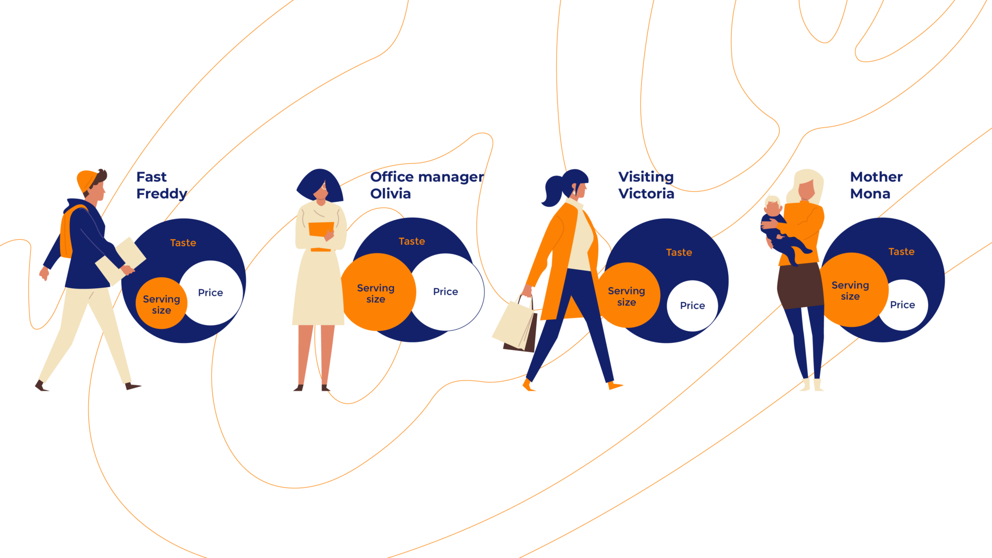
We began with the quantitative evidence, followed by store checks, conversations with consumers across Estonia, focus groups and a detailed audit of the core brand and its many offspring.
The aim was not to ask whether people liked chocolate. Research budgets have limits. We needed to understand the situations in which people chose Kalev, what alternatives they considered and which products they could actually remember by name.
The answer was encouragingly concrete. Distinctive tastes and products—Maiuspala, Tiina, Tuljak and their friends—had earned their own place in people’s memories. Duplication and muddled packaging had not.
03
Give every sweet its proper shelf
We reorganised the portfolio into three clear value segments. Familiar candies, marmalades and caramels formed the broad foundation. Well-known chocolate bars and distinctive favourites made up the centre. Artisan candies and truffles took their rightful place at the top, where special things—and their prices—belong.
This gave individual products room to be recognised while making the whole family unmistakably Kalev. A portfolio stopped behaving like a crowded drawer and started behaving like a system.
04
One family. Plenty of personalities.
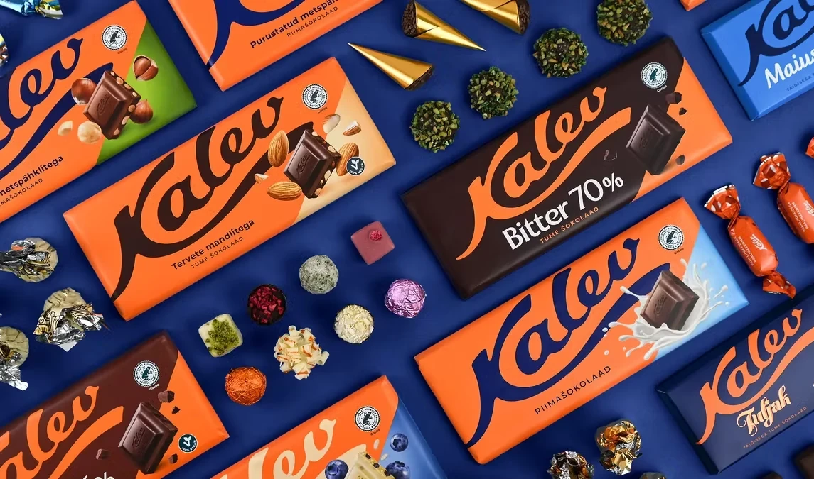
Together with Kalev and KOOR’s packaging team, we spent more than a year turning the strategy into a visual language. Consumer testing with Norstat helped evaluate shelf visibility, coherence, attractiveness and—rather importantly—whether people could still recognise their favourites.
The blue signature logo became the element holding the portfolio together. Consistent typography, flavour icons and a flexible colour corner created order without forcing every product into the same uniform.
The result is a bolder and more coherent Kalev: recognisable from a distance, distinctive up close and still Estonia’s No. 1 consumer brand. No national treasures were harmed in the process.
The useful restraint